Brand New reString reBrand
Juan
reString has rebranded in 2026, six years on from when the brand was first founded.
The original identity was put together quickly, built to get the brand live and moving rather than as a long-term visual system designed to last.
Since then, reString has grown into something that identity could no longer represent.
This article covers why the rebrand happened now, what specifically changed, what the new identity is meant to communicate, and what this means for you as a player.
Where reString Started in 2020
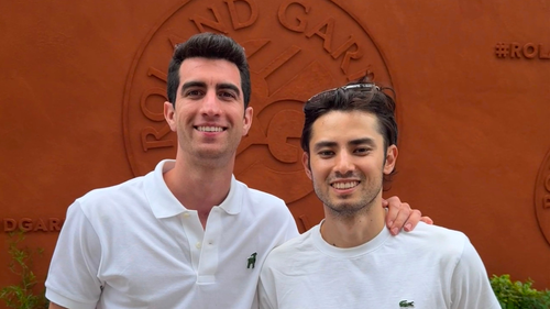
reString was founded in 2020 by two friends building a brand across the globe.
The original logo came together very early in that process, before any strings existed in their current form and before a clear brand personality had been established.
The brief at the time was simple: get something live and start moving.
What came out of that was an identity that served its purpose in the moment. It was the right call for where the brand was then. It is just no longer representative of where the brand is now.
What reString Looks Like in 2026
Six years later, the brand looks fundamentally different from when we started.
reString now has: reString Zero, reString Slap, reString Sync, and reString Vivo.
We have produced a lot of content in our Journal around strings and performance, which has helped establish us as string specialists rather than just another string company.
We have also developed genuine connections in the tennis community, including athletes competing at both the ATP and WTA level.
The brand has a defined personality, a differentiated direct-to-player business model, and a clear point of view on what strings should do.
The original identity predated all of that. The central question the rebrand set out to answer was straightforward: what does reString actually represent in 2026?
Minimal, but More Technical

The design direction was not a departure from minimalism. Minimalism was always core to the brand and already showed up in the packaging, the materials, and the color choices.
The goal was to refine it toward something more technical and expert-led. The brief we made said to explicitly avoid loud colors, heavy text, and a noisy aesthetic that is common in tennis.
The result of that is that when someone encounters the new brand for the first time, they read it as a technical expert brand. Something precise, built by people who know what they are doing.
The references that shaped this direction were brands that combine technical credibility with clean, intentional design: On, Bandit Running, and Salomon.
What those brands share is the ability to look considered and minimal without losing authority as leaders in their respective industries.
The New Identity, Up Close
The Wordmark

One specific decision was dropping the capital R from the wordmark, making it "reString" rather than "ReString." This was partly an aesthetic choice, but more importantly a strategic one.
The lowercase r keeps the eye moving toward the capital S and through the word "String," giving the string expertise more visual weight. That reemphasis on "string" within the name reinforces that this is a brand with real authority in that specific category.
It ties into a broader positioning: reString as a technically credible string specialist, not a generalist tennis brand.
The Icon

A key structural issue with the old identity was that the original icon could not function independently. It only worked when placed alongside the full wordmark. On its own, it lacked the recognizability and versatility needed across smaller placements.
The new brief required an icon that could stand alone, with enough presence and clarity to work as a social profile image, on Google, within website details, and across other brand applications.
The rebrand therefore went beyond refreshing the wordmark. It created a more ownable and versatile icon.
A Family of Strings, Not a Product List

reString's strategy has never been to build a bloated lineup of 25 strings. The goal is an ecosystem, a family of strings with depth and coherence.
As part of the rebrand, each string line now gets its own logo and visual identity. reString Zero, reString Slap, reString Sync, and reString Vivo each function as a sub-brand.
The visual language is consistent across the family: a sharp, geometric custom typeface with angular cut details that reads as technical and precise, with each string carrying its own color.
The analogy is Nike with the Jordans. These are not just product names but recognizable franchises with their own identities sitting within a broader brand architecture.
That is the standard we are building toward. It gives each string a life of its own while pulling together as a coherent family under the reString name.
Built for Players, Not Retailers
Most tennis string brands operate primarily as B2B businesses, focused on selling into shops and retailers rather than building directly for the players who use the strings.
reString has always operated differently.
Our customers are end users and players, and the brand has been direct-to-player since day one. That distinction changes what a brand needs to look like and how it needs to behave.
Players care about design, how the string looks in their racket, how the brand's aesthetic reflects on them, and what being associated with the brand says about them.
A player-first brand needs to be design-aware to create a visual identity that players respond to.
This also extends to the website as part of the rebrand. The homepage direction has been updated and the layout rebuilt around getting players to products more quickly.
The visual identity and the digital experience now pull in the same direction: built around the person holding the racket, not the person running the shop.
Summary
The new reString reBrand is about alignment. The visual identity now reflects the products we make, the expertise we have developed, and where the brand genuinely is in 2026.
The original identity served its purpose in getting the brand moving. The new one is built to carry us forward.
Explore our string lineup on our Discovery page or find your match with the String Finder tool.
About the Author: Juan is the co-founder of reString. He was born in Argentina, raised in Japan, and moved to the US to pursue college tennis. He now plays as an ATP & WTA hitting partner.